Drop Down
Field Configuration: To add Drop Down field in a form, go to User Meta >> Forms. Add a new form or edit an existing one. In the Form Builder menu click Drop Down from right sidebar of Extra Fields section. Then you will have a configuration panel. Configure your Drop Down field by using this configuration panel.
Basic Configuration:
This part consists of Field Label, Label Position, Description, Meta Key, Default Value, Field’s Options and Requirement of the field.
Field Label: Set the field’s name whatever you want.
Label Position: Set where the name of the field will be visible. There are several options.
You can place it at Top, Left, Right, Inline or Placeholder. You can even hide the name by
selecting the option Hidden.
Description: Write the description of the field, if you want. Description will be visible
under the field box.
Meta Key: Use meta key to save field’s data. Without defining the meta key, field data won’t be saved.This is unique identification key for field. E.g. gender (unique and no space).
Options & Advanced mode: Write down the options for the dropdown field. ‘L’ is for label of the option. Add more options with ‘+‘ button and to delete existing option use ‘–‘. Value for a specific option will be the same as the label unless Advanced mode is activated and different value is written.
Can set a default value by clicking the circle (beside your preferred option) so the field will have the value even if it is ignored.
In Advanced mode you can classify options by different groups. Create groups by naming them and place them with drag and drop procedure. Activate these options by checking Advanced mode.
Required: Check Required if you want the field must to be filled.

*(For UMP versions older than 1.2)
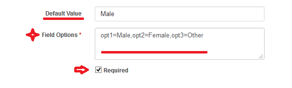
Default Value: Can set a default value so that the field will have the value even if the field is ignored.
Field Option: Define field’s options. By using “opt1=Male, opt2=Female, opt3=Other”, data will save in database “opt1, opt2, opt3” format wise but forntend will show “Male, Female, Other” respectively. Instead of above example, data can be directly saved by using “Male, Female, Other” only.
Advanced Configuration:
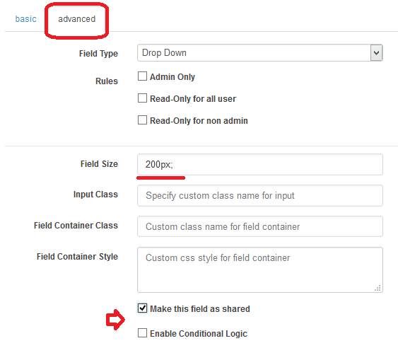
This part consists of Rules, Field Size, Input Class, Field Container Class, Field Container Style, Make the Field as Shared and Conditional Logic.
Rules: You can set the field only for the admin by checking Admin Only. Also can select Read-Only for all user or Read-Only for non admin.
Field Size: Set the size of the field. For example: to make a 200px field just write 200px; in the box.
Input Class: Can specify custom class for input. Write the custom class name.
Field Container Class: Can set custom class for field container. Write the custom class name.
Field Container Style: Can set custom css style for field container.
Make Field as Shared: To make this field as a shared field to use the field in any form just check Make this field as shared.
Conditional Logic: To apply conditional logic to this field Enable Conditional Logic. To know about conditional logic, read Fields Basics.
Generated Field:
For these configurations, generated drop down field will be like below.
