Number
Field Configuration: To add Number field in a form, go to User Meta >> Forms. Add a new form or edit an existing one. In the Form Builder menu click Number from right sidebar of Extra Fields section. Then you will have a configuration panel. Configure your Number field by using this configuration panel.
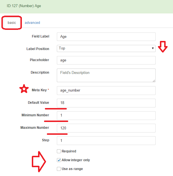
Basic Configuration:
This part consists of Field Label, Label Position, Placeholder, Description, Meta Key, Default Value,Minimum Number,Maximum Number, Step, Requirement of the field, Allow integer only and Use as range.
Field Label: Set the field’s name whatever you want.
Label Position: Set where the name of the field will be visible. There are several options.
You can place it at Top, Left, Right, Inline or Placeholder. You can even hide the name by
selecting the option Hidden.
Placeholder: You can set a placeholder name for this field to provide information of the
field and use it in different places.
Description: Write the description of the field, if you want. Description will be visible
under the field box.
Meta Key: Use meta key to save field’s data. Without defining the meta key, field data won’t be saved.
This is unique identification key for field. E.g. age_number (unique and no space).
Default Value: Can set a default value so that the field will have the value even if the field is ignored.
Minimum Number: Set the number range to choose between. Here, you set the minimum value of the field.
Maximum Number: Set the maximum possible number value for the field.
Step: Set step value that indicates how the number can be increased or decreased. For example: if you set the step value as 5, the field value can be increased or decreased by 5.
Required: Check Required if you want the field must to be filled.
Allow integer only: This option is for allowing integer value only and saying no to all fraction value.
Use as range: Enable Use as range to give the viewer the option of range selection.
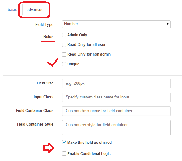
Advanced Configuration:
This part consists of Rules, Field Size, Input Class, Field Container Class, Field Container Style, Make the Field as Shared and Conditional Logic.
Rules: You can set the field only for the admin by checking Admin Only. Also can select Read-Only for all user or Read-Only for non admin.
Unique: Make the field as unique so that no one can provide the same information.
Field Size: Set the size of the field. For example: to make a 200px field just write 200px; in the box.
Input Class: Can specify custom class for input. Write the custom class name.
Field Container Class: Can set custom class for field container. Write the custom class name.
Field Container Style: Can set custom css style for field container.
Make Field as Shared: To make this field as a shared field to use the field in any form just check Make this field as shared.
Conditional Logic: To apply conditional logic to this field Enable Conditional Logic. To know about conditional logic, read Fields Basics.
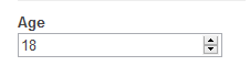
Generated Field:
For these configurations, generated number field will be like below.
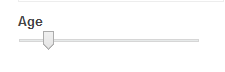
And when Use as range option is enabled.